15. Plotting, I: View 1D array(s)
We often want to visualize data or results. There are many, many ways to make graphs, plots or images, depending on the type of data and context. We start here by considering basic plotting of two variables, i.e., the classic "x-y" plots.
We will meet Python's Matplotlib module, which will be essential to this work. Additionally, we will also use the NumPy module quite a bit, because we will be working with arrays:
import matplotlib.pyplot as plt     # for plotting
import numpy as np                  # for working with arrays
15.1. Basic plot
Let's say we're interested in plotting a relation between two
variables such as  in a given interval
 ![x \in
[-2, 2].](../_images/math/868ee4a3537948ae9e489459ecc1b4e95dc94df6.svg) Mathematically, there is a continuous relationship between
two real numbers, and that all the values are well-behaved (no
infinities). How do we use a computer to display this?
Mathematically, there is a continuous relationship between
two real numbers, and that all the values are well-behaved (no
infinities). How do we use a computer to display this?
Well, Python will not be able to generate a plot of  and
and
 from the abstract/generalized mathematical formula above. We
will need to generate concrete values to approximate the curve and
then plot these. Essentially, we have to back to basics, to our early
school days when we learned to plot by hand. To approximate a
continuous curve, we: made a column of values and then a
corresponding column of calculated values; drew a coordinate
plane and placed a dot on it for each
from the abstract/generalized mathematical formula above. We
will need to generate concrete values to approximate the curve and
then plot these. Essentially, we have to back to basics, to our early
school days when we learned to plot by hand. To approximate a
continuous curve, we: made a column of values and then a
corresponding column of calculated values; drew a coordinate
plane and placed a dot on it for each  pair; and
then connected the dots in order using a straight line segment. Below
is the kind of image that would result, and in fact this is exactly
how we will harness the amazing technological innovations of
computers:
pair; and
then connected the dots in order using a straight line segment. Below
is the kind of image that would result, and in fact this is exactly
how we will harness the amazing technological innovations of
computers:
|
|---|
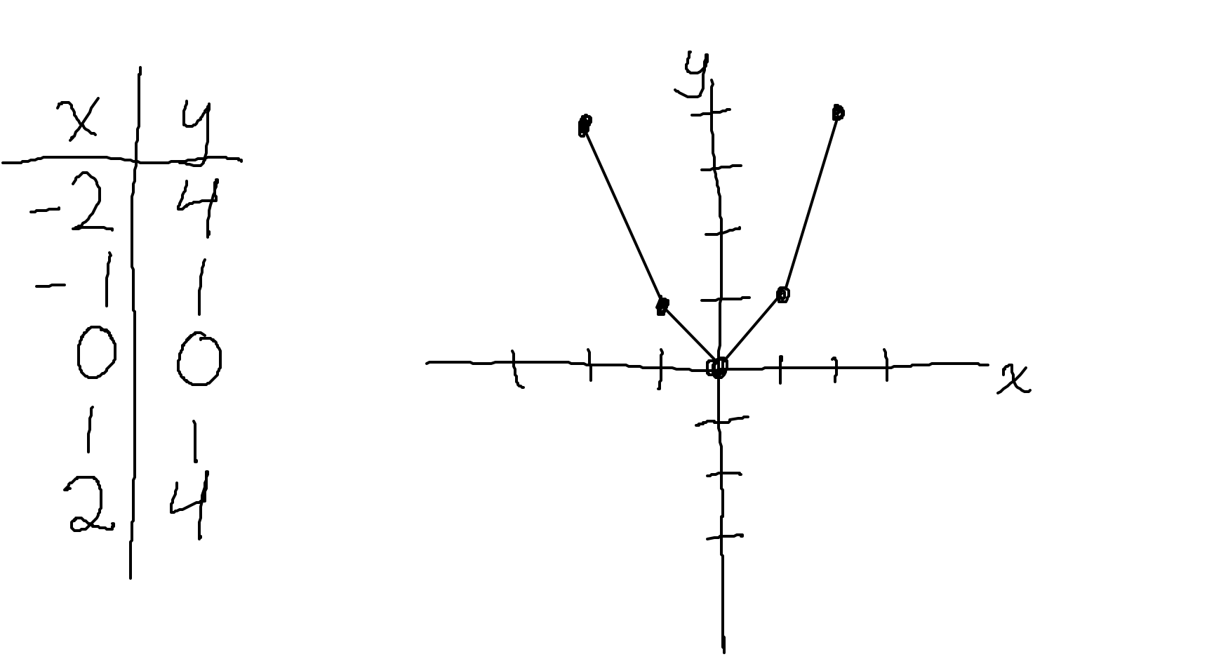
Recalling early days of simple plotting: construct two columns
of numbers, with each ith row providing an |
 pair to be placed on the graph at the right. The pairs
can be connected by straight lines for (sometimes blocky)
continuity.
pair to be placed on the graph at the right. The pairs
can be connected by straight lines for (sometimes blocky)
continuity.In the previous section, we studied 1D arrays. Do you see any way we can apply knowledge here? Well, looking at the sequence of numbers in x and y above, each looks like a 1D array, doesn't it? Indeed, to start translating what the above into programming, we can first use arrays to store the values of the x and y columns. We might notice that x has evenly spaced values, so we could use a numpy function built for making such an array easily; for y, we will just type out the values:
x = np.linspace(-2, 2, 5)            # 5 values: -2. -1.  0.  1.  2.
y = np.array([4, 1, 0, 1, 4])
Looking at our plot above, we should appreciate that the x and
y arrays must always have the same length: each point is a
coordinate pair of a corresponding element in the two arrays---e.g.,
 or, programmatically,
 (x[0], y[0]).
Q: How could you write a Python expression to check that the two arrays have the same length?
+ show/hide codeWe can then make use of the plt.plot() function to generate the
graph of the element pairs. Let's look at its help for usage via
plt.plot?. Here, we just show the top section of the docstring
(which is quite long, with a great amount of control of plotting
behavior) and then the top part of the description of the parameters
(which is further down in the help):
 1Signature: plt.plot(*args, scalex=True, scaley=True, data=None, **kwargs)
 2Docstring:
 3Plot y versus x as lines and/or markers.
 4
 5Call signatures::
 6
 7    plot([x], y, [fmt], *, data=None, **kwargs)
 8    plot([x], y, [fmt], [x2], y2, [fmt2], ..., **kwargs)
 9
10The coordinates of the points or line nodes are given by *x*, *y*.
11
12The optional parameter *fmt* is a convenient way for defining basic
13formatting like color, marker and linestyle. It's a shortcut string
14notation described in the *Notes* section below.
15
16>>> plot(x, y)        # plot x and y using default line style and color
17>>> plot(x, y, 'bo')  # plot x and y using blue circle markers
18>>> plot(y)           # plot y using x as index array 0..N-1
19>>> plot(y, 'r+')     # ditto, but with red plusses
20
21...
22
23Parameters
24----------
25x, y : array-like or scalar
26    The horizontal / vertical coordinates of the data points.
27    *x* values are optional and default to `range(len(y))`.
28
29    Commonly, these parameters are 1D arrays.
In Line 1, we see a couple keyword args provided, but in fact there
are too many possible input parameters and combinations to list there
individually, so the help just puts *args and **kwargs to
denote that more of each kind of input are possible. Looking at the
example call signatures in Lines 7-8, we see thing that might be what
we want we want: plotting one or two 1D arrays (because in lines
25-27, we see that that is what x and y commonly represent).
In Lines 16-17 we see basic examples of plotting "y vs x", or in Lines
18-19 we see we could just "y" by itself, with abscissa values
automatically made as int values from  . These look
usable with the arrays we have, so let's try the first one from Line
16:
. These look
usable with the arrays we have, so let's try the first one from Line
16:
plot(x, y)
plt.show()
Why are there two commands needed here? Well, plotting is generally is a two-step process in Python: first, make the plot; then, show the plot. And that plot looks like this:

... which is basically what we had above (just without the
 and
and  lines). What do the other three example
plots in Lines 17-19 look like? They play around with plotting styles
and properties. For example, they show the points separately with
"marker" symbols and change colors:
lines). What do the other three example
plots in Lines 17-19 look like? They play around with plotting styles
and properties. For example, they show the points separately with
"marker" symbols and change colors: 'bo' is a shortcut, where "b"
is for blue and "o" for a circle marker; 'r+' is similar, but for
red cross markers. By putting only one array in the positional
arguments, the x-axis becomes the integer-spaced values from
:
 |
 |
 |
|
|
|
Note that the cases of only y being plotted are not appropriate
here; the curve is effectively shifted to the right, as seen by the
minimum appearing where x=2. But in other cases, it might be a
useful syntax.
There is a lot of overlapping functionality across Matplotlib functions and arguments to control the appearance of plots. We will try to introduce a starting sampler of optionality, below. In all cases, we recommend browsing the help docstrings of the mentioned functions, as well as explore others in the module.
15.2. Plot styles and properties
More than one line can be plotted on a graph. Let's add another array of ordinates (and keep the same x-values):
y2 = np.array([-1, 2, 0.5, -0.5, 1])
By default, Python will add new lines with distinct colors, but let's look at specifying colors, as well as line styles and marker styles. In most cases we will specify these things with keyword arguments to the plotting function.
Again, the plt.plot? doc string is long, but under "Properties:"
there is a list of kwargs, of which a few relevant ones are:
 1...
 2Properties:
 3color or c: color
 4linestyle or ls: {'-', '--', '-.', ':', '', (offset, on-off-seq), ...}
 5linewidth or lw: float
 6marker: marker style
 7markeredgecolor or mec: color
 8markeredgewidth or mew: float
 9markerfacecolor or mfc: color
10markerfacecoloralt or mfcalt: color
11markersize or ms: float
12...
In some cases there is both a long and short version of the same
keyword (e.g., linewidth and lw). To the right of the colon,
the kind of expected value is listed, in most cases here either a
float (for a size) or a string (for a color or style). Example
linestyle values are provided there, but in many few cases of interest
the list is so long that they are displayed further down in the doc
string; we provide a few here:
+ show/hide plot line styles
+ show/hide plot color abbrevs
The basic plotting examples above showed how the character color abbreviations can be combined with either markers or line styles. And a gallery of Matplotlib's "named" colors is provided at the bottom of this page.
How do we use these parameters? Here is an example, showing two curves in a single figure:
 1plt.plot(x, y, color = 'magenta', ls = '-.', lw = 2, marker = 'v', ms = 8)
 2
 3plt.plot(x, y2,
 4         color  = 'k',
 5         ls     = ':',
 6         lw     = 2,
 7         marker = 'o',
 8         mew    = 2,
 9         mec    = 'dodgerblue',
10         mfc    = 'limegreen',
11         ms     = 6)
12
13plt.ion()
14plt.show()
Some comments on these commands:
You can check the the descriptions of the keywords with the function's doc string or tables above.
We could have used some of the above abbreviations for color and lines, like
m-.in place ofcolor = 'magenta', ls = '-.', but once we are specifying a lot of options, using the full option names may be easier to read.Note how in the second
plt.plotcommand, we were specifying so many options that we decided to space them onto separate lines. This can be convenient for clarity, both for reading and changing options; the indentation of each option is not necessary here, it is a programming style choice that aids reading (as does vertically aligning the=symbols).Calling the
plt.ion()function just beforeplt.show()turns interactive mode "on", which will not add functionality in the Jupyter notebook environment, but if working in iPython allows one can keep typing commands without having to close the plot.Plotted arrays are displayed in the order listed, so the first one will be furthest in the background and the last one in the foreground.
Anyways, the above leads to the colorful plot:

Note
Earlier, we noted that the Python interpreter reads each
line separately, and if you want to spread a single command
onto the next line you would use the continuation of
line character \. How, then,
can the above plt.plot() span Lines 3-11 without using
\ at all?
It happens because there is an opening parenthesis ( in
Line 3, and the interpreter will continue to treat
everything it reads as part of that single expression until
it reaches the closing ). See here for more examples of Python's
automatic line continuation.
15.3. Titles, labels and axis details
We can add a lot more features to the plot that really make it useful for presenting information. For example, right now we don't know anything about what the units along the x- and y-axes, and adding a title would be helpful to know what is being plotted.
We can even put a legend into the plot to show labels for each plot:
this is done by adding a label = `` kwarg to each plot with a string
value to display, and then use of the ``plt.legend() function before
showing the plot. We can let Matplotlib guess a good location for the
legend or specify it ourselves. Consider the following:
 1plt.plot(x, y, color = 'magenta', ls = '-.', lw = 2, marker = 'v', ms = 8,
 2         label = 'y')
 3
 4plt.plot(x, y2,
 5         color  = 'k',
 6         ls     = ':',
 7         lw     = 2,
 8         marker = 'o',
 9         mew    = 2,
10         mec    = 'dodgerblue',
11         mfc    = 'limegreen',
12         ms     = 6,
13         label  = 'y2')
14
15plt.xlabel('x (in meters)')
16plt.ylabel('data measurement (in meters)')
17plt.title('Important results')
18plt.legend(loc='upper center')
19
20plt.ion()
21plt.show()

Note
Python can interpret LaTeX's "math mode" in strings. So if
you are familiar with this powerful way to write technical
expressions, you can spice up your plots. Just note that
LaTeX's escape character \ is also recognized as such in
Python, and so one has to include 2 of them in most cases so
that it gets passed through to LaTex correctly.
For example, we could use the formula  in the first plot's label, above. In pure Latex, this would
be encoded as
in the first plot's label, above. In pure Latex, this would
be encoded as $y \approx x^2$; however, the Python
string in the label would have to contain it as: $y
\\approx x^2$. You can verify this in the string label
above.
Matplotlib estimates default ranges of both the x- and y-axes to
display the full area of plotted points. The limits of each can be set
separately with plt.xlim() and plt.ylim() functions,
respectively. (Here and below, if there is a plt.xSOMETHING()
function, one can generally expect to find a plt.ySOMETING()
function with similar parameters and syntax, and vice versa.) Note
that setting the bounds this way can chop of pieces of the plot.
Additionally, we can set the relative units or ratio of units between
the two axes. For example, if the axes both share the same units, we
might want to make sure that a distance between the "0" and "1" in
each case covers the same amount of plot space; that is, a circle
should appear as a circle, not as an oval because one axis is
stretched compared to another (by default, the module will not try
to ensure this -- it treats the axis units as independent). The
plt.axis() function can take the arguments 'scaled' and
'equal' as two different ways to try to enforce the relationship
of axis units: the former tries to adjust the dimensions of the plot,
and the latter tries to change the ranges (so it might lead to
ignoring plt.xlim and plt.ylim settings).
The locations along the plot edges with dashes and numbers labelling
the axis are known as major ticks. Matplotlib has some inner
formula to place these by default. But you can pass an array of
values for the tick locations along either axis with plt.xticks()
or plt.yticks(). The ticks can even be turned off by passing an
empty list with, for example, plt.xticks([])
The axes are labelled with numbers, but sometimes adding in the
standard x- and y- axes provide useful visual cues. While we could
make more arrays to accomplish this, there are Matplotlib functions
for plotting such lines: plt.axhline() plots a horizontal line
that is by default at and across the entire plot; and
plt.axvline() is the vertical analogue. If we might want these to
be in the background, we would plot these before the main curves. As
a style point, I often like making these light gray (instead of
default black) and a bit thinner than the default.
As we start making several plots, it can be useful to use the
plt.figure() function to signify the start of a new plot;
otherwise, we might just keep adding to existing plots accidentally.
Later, we will also see that we can control useful feature about the
plot (size, dimensions, resolution) using this function, too.
 1plt.figure("example plot 7")
 2
 3plt.axhline(c = '0.75', lw = 0.5)  # horiz line (def, y=0), light gray color
 4plt.axvline(c = '0.75', lw = 0.5)  # vert line (def, x=0), light gray color
 5
 6plt.plot(x, y, color = 'magenta', ls = '-.', lw = 2, marker = 'v', ms = 8,
 7         label = 'y')
 8
 9plt.plot(x, y2,
10         color  = 'k',
11         ls     = ':',
12         lw     = 2,
13         marker = 'o',
14         mew    = 2,
15         mec    = 'dodgerblue',
16         mfc    = 'limegreen',
17         ms     = 6,
18         label  = 'y2')
19
20plt.axis('scaled')             # call *before* plt.xlim and plt.ylim
21plt.xlim(-3, 3)
22plt.ylim(-1, 5)
23plt.yticks(ticks=np.linspace(-1,5.5, 0.5))
24
25plt.xlabel('x (in meters)')
26plt.ylabel('data measurement (in meters)')
27plt.title('Important results for the $^2\\Psi_\\alpha$ particle')
28plt.legend()                   # let plt guess a good legend location
29
30plt.ion()
31plt.show()
... which leads to:

15.4. Grid of plots
In addition to displaying several curves in the same plot, we can also
make a single figure with several plots. There are multiple syntaxes
for doing this. At its most basic, we can picture the figure being
made up of an  matrix of plots, which we can walk
through, row-by-row from the upper left plot (and each plot is indexed
from
matrix of plots, which we can walk
through, row-by-row from the upper left plot (and each plot is indexed
from ![[1, NM]](../_images/math/6d86a79c3b419bb33d6810655faa9ce0fb6beca4.svg) ), adding relevant details to each one. This is
specified with
), adding relevant details to each one. This is
specified with plt.subplot(), which is used to indicate both the
dimensions of the grid and which particular plot we want to edit.
From its docstring plt.subplot?:
 1Signature: plt.subplot(*args, **kwargs)
 2Docstring:
 3Add a subplot to the current figure.
 4
 5...
 6
 7Call signatures::
 8
 9   subplot(nrows, ncols, index, **kwargs)
10   subplot(pos, **kwargs)
11
12...
13
14Parameters
15----------
16*args
17    Either a 3-digit integer or three separate integers
18    describing the position of the subplot. If the three
19    integers are *nrows*, *ncols*, and *index* in order, the
20    subplot will take the *index* position on a grid with *nrows*
21    rows and *ncols* columns. *index* starts at 1 in the upper left
22    corner and increases to the right.
23
24    *pos* is a three digit integer, where the first digit is the
25    number of rows, the second the number of columns, and the third
26    the index of the subplot. i.e. fig.add_subplot(235) is the same as
27    fig.add_subplot(2, 3, 5). Note that all integers must be less than
28    10 for this form to work.
In the "Parameters" section, the first paragraph under *args
refers to the syntax of Line 9. The second paragraph under there
refers to Line 10. They both contain the same information: basically,
if each of the number of rows, number of columns and total number of
plots is a single digit ( ), then you can use the "simpler"
second form. Otherwise, you must use the first one. The descriptions
above will probably be clearer with an example.
), then you can use the "simpler"
second form. Otherwise, you must use the first one. The descriptions
above will probably be clearer with an example.
Let's first make another set of 1D arrays to plot:
x3 = np.array([-2, -1.5, -1, -0.5, 0, 0.5, 1, 1.5, 2])
y3 = np.array([4, 2.25, 1, 0.25, 0, 0.25, 1, 2.25, 4])
Where this is similar to the original x and y array pair, but
with a smaller step size along the x-axis and hence a better
approximation to the analytic  curve. To see how this
compares, we will plot this with the original 1D arrays on one
subplot, and then put
curve. To see how this
compares, we will plot this with the original 1D arrays on one
subplot, and then put y2 on a second subplot.
 1plt.figure("subplot example")
 2
 3plt.subplot(1, 2, 1)                  # first plot in 2x1 grid
 4
 5plt.axhline(c = '0.75', lw = 0.5)
 6plt.axvline(c = '0.75', lw = 0.5)
 7
 8plt.plot(x, y, label = 'step=1')
 9plt.plot(x3, y3, label  = 'step=0.5')
10
11plt.axis('scaled')
12plt.xlim([-2.5, 2.5])
13plt.ylim([-2, 5])
14plt.xlabel('x')
15plt.ylabel('height')
16plt.title('Approximations to $y=x^2$')
17plt.legend()
18
19plt.subplot(1, 2, 2)                  # second plot in 2x1 grid
20
21plt.axhline(c = '0.75', lw = 0.5)
22plt.axvline(c = '0.75', lw = 0.5)
23
24plt.plot(x, y2, marker='o', c = 'green')
25
26plt.axis('scaled')
27plt.xlim([-2.5, 2.5])
28plt.ylim([-2, 5])
29plt.xlabel('x')
30plt.title('The other plot')
31
32plt.ion()
33plt.show()
Since the number of plots is in single digits, we could have written
the subplot commands in the abbreviated syntax: subplot(121) and
subplot(122). In either case, the output plot would look the
same:

15.5. Save to file
Matplotlib contains a function to save a figure to a file, called
plt.savefig(). You can use it instead of, or along with (e.g.,
calling it after), plt.show().
The main argument to provide is a positional one: the output filename. This filename can include path elements to write the file directly to another directory, otherwise it is written to the current working directory. The filename should typically include a relevant file extension, which is the short few characters at the end of a file (following ".") to specify the format of the file.
For images, png, jpg and tif are some the most common
extensions or formats. These are all part of a grouping called
rasterized images, for which you can think of the entire image
being chopped up into a regular 2D grid to store the information; the
lines and dots just paint in the grid elements to form the stored
image. For such files, specifying the spatial resolution of the grid
is important: just like with computer or cell phone screens, the
images can be "nicer" and more detailed with higher resolution images.
This is quantified with dots per inch (DPI), with greater DPI
being higher resolution. Python uses some default DPI when saving
images, but one can also specify kwarg in the function, such as:
plt.savefig("figure_01.png")                # save to current dir, def DPI
plt.savefig("../output_dir/figure_02.png")  # save to another dir, def DPI
plt.savefig("figure_03.png", dpi=300)       # save to current dir, set DPI
Having a higher DPI might produce a nicer image, or one that can be zoomed in usefully, but also a larger file size. How large the file size (and how it scales with DPI) depends on the image format; but that is precisely why there are different image formats: they store information differently, typically with an aim to compress the image into as small a size on the computer as possible. There is no universally "best" resolution -- the choice is usually context dependent. Many scientific journals require published figures to have a DPI of at least 300, but lower is probably fine for many applications.
A different class of images are known as vector graphics, which
include svg, pdf (yes, the same one often used for text
documents) and eps. These save the lines and letters of the plot
as separate objects, which retain their identity when saved to file.
This means that when zooming in, the image doesn't start looking
grainy as the grid level gets reached. For line images and text, or
images generated with lots of shapes, this can be a very useful file
format. (If you have a standard photograph, then the continuous
nature of most elements would rule out vector graphics as a good
format.) Specifying a vector graphic file output follows the same
syntax as for rasterized images, above:
plt.savefig("figure_01.svg")
etc.
Which file format is best for your image? You can always test a couple
options and see-- be sure to check both the normal image, the zoomed
image and the file size. There are also other file formats out there,
too. Note that some have tradeoffs-- the above formats are all
lossless meaning that they don't try to sacrifice image quality
for file size, but other formats will (they are lossy). For
example, gif is another rasterized graphic with fairly compact
file size, but generally poor quality; it is popular for simple,
lightweight web images and movies, but would not be a good choice for
most plots.
Finally, we note if you want to control the size of the saved image,
that is done using the figsize kwarg in the plt.figure()
function. It is necessary to provide both the width and height of the
final figure, so this pair of values must be grouped together, e.g.:
plt.figure("some fig label", figsize=(WIDTH, HEIGHT))
The units of WIDTH and HEIGHT are inches.